
The Hidden Tax Every Chat Interface Charges, and Who Pays It First
What ADHD, dyslexia, and executive function can teach AI design

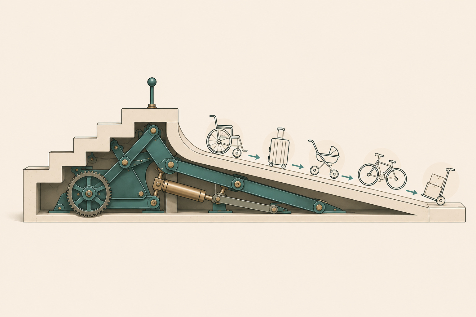
Neurodivergence is more common than most people think and for a long time the expectation has been that people work around it quietly. For example masking, compensating, finding your own systems and often at a cost.
Curb cuts were built for wheelchair users, but it turned out almost everyone benefits for example parents with prams, travelers with luggage and anyone with their hands full. This is called "the curb cut effect" is the phenomenon where features or policies originally designed to assist a specific, marginalised group end up benefiting a much broader population. I came across it while studying Engineering and it's stuck with me ever since.
AI chat interfaces are at a similar fork. Most are designed around an implicit “default” user, someone who thinks linearly, holds context easily, wants instant answers and rarely needs to backtrack. People with neurodivergence e.g. ADHD or dyslexia feel that mismatch hardest. The following article, focuses on ADHD as an example of how we can re-design conversational interfaces for a mind that doesn't default to linear, instant, or one-track and you end up with interfaces that work better for everyone.
Russell Barkley’s model of executive function gives a useful way to breakdown some of the dimensions of ADHD we can support around:
(1) Working memory, holding information while you use it.
(2) Inhibition, filtering out what doesn’t matter.
(3) Self-regulation, managing motivation and frustration well enough to keep going.
(4) Reconstitution, planning, generating options, adapting when the first idea doesn’t work.
Designing for working memory, holding memory whilst you use it
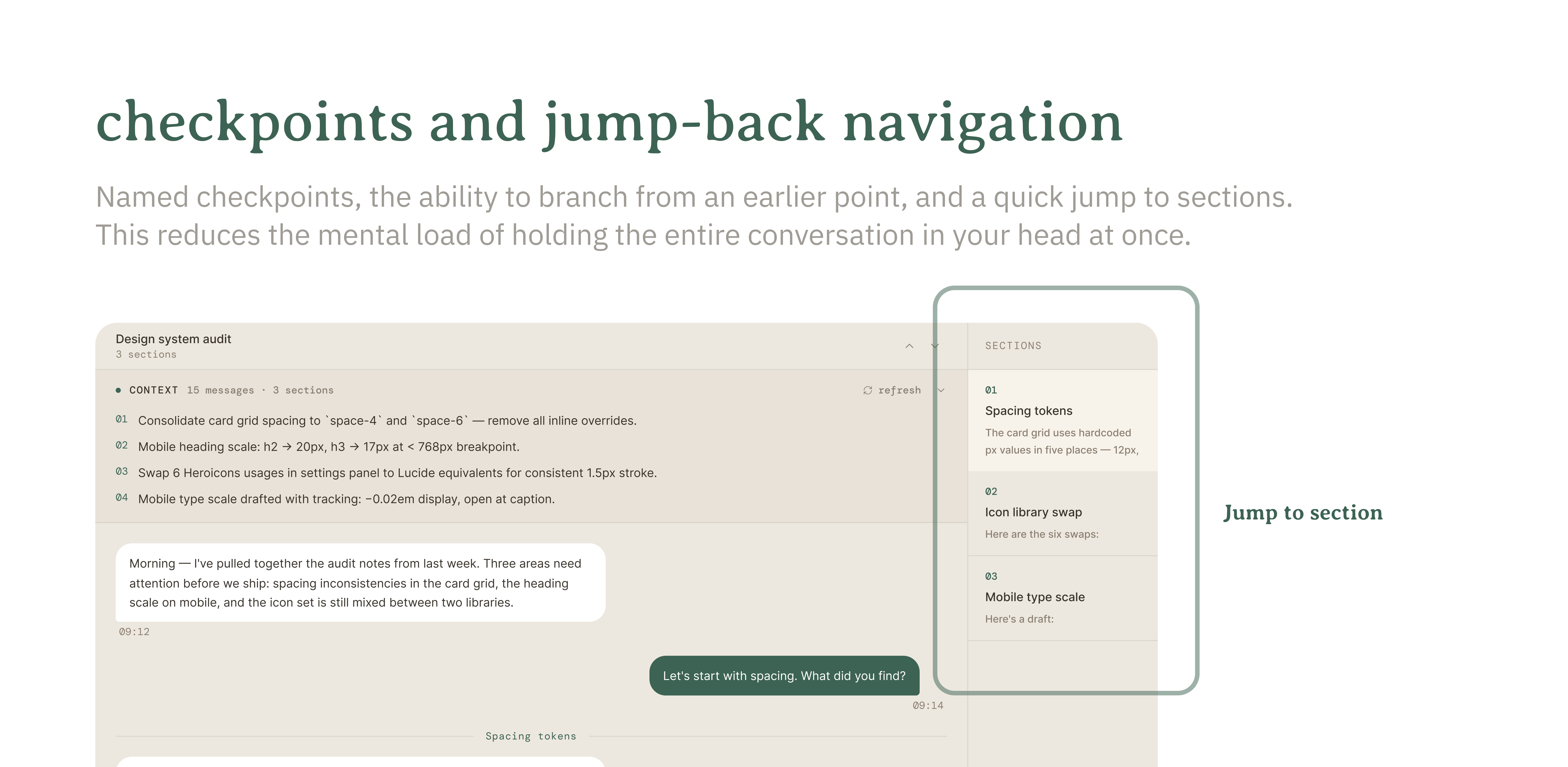
Design feature: checkpoints and jump-back navigation
A conversational interface to date is usually one long thread, therefore revisiting something means scrolling, searching, or trying to remember where it was.
Having named checkpoints, the ability to branch from an earlier point, a quick “jump to where we were figuring out X”, all reduce the load of holding the whole conversation in your head at once
Design feature: persistent context, surfaced not buried
If a chat can hold context across a session, history, open threads, things flagged for later, make that visible and usable. A simple “here’s where we left off” does more for cognitive load than almost any other feature and it’s the default experience that happens to matter more for some people first.
Design feature: parallel, switchable threads
Some people need to hold several half-finished ideas open in parallel, circling back as they connect. Designing for multiple live threads that stay switchable without losing context isn’t clutter. For some people it’s the only way they actually think. Figma Make does this well with the way it sets up different paths to enable you to explore different concepts in one file.
Designing for inhibition, filtering out what doesn’t matter
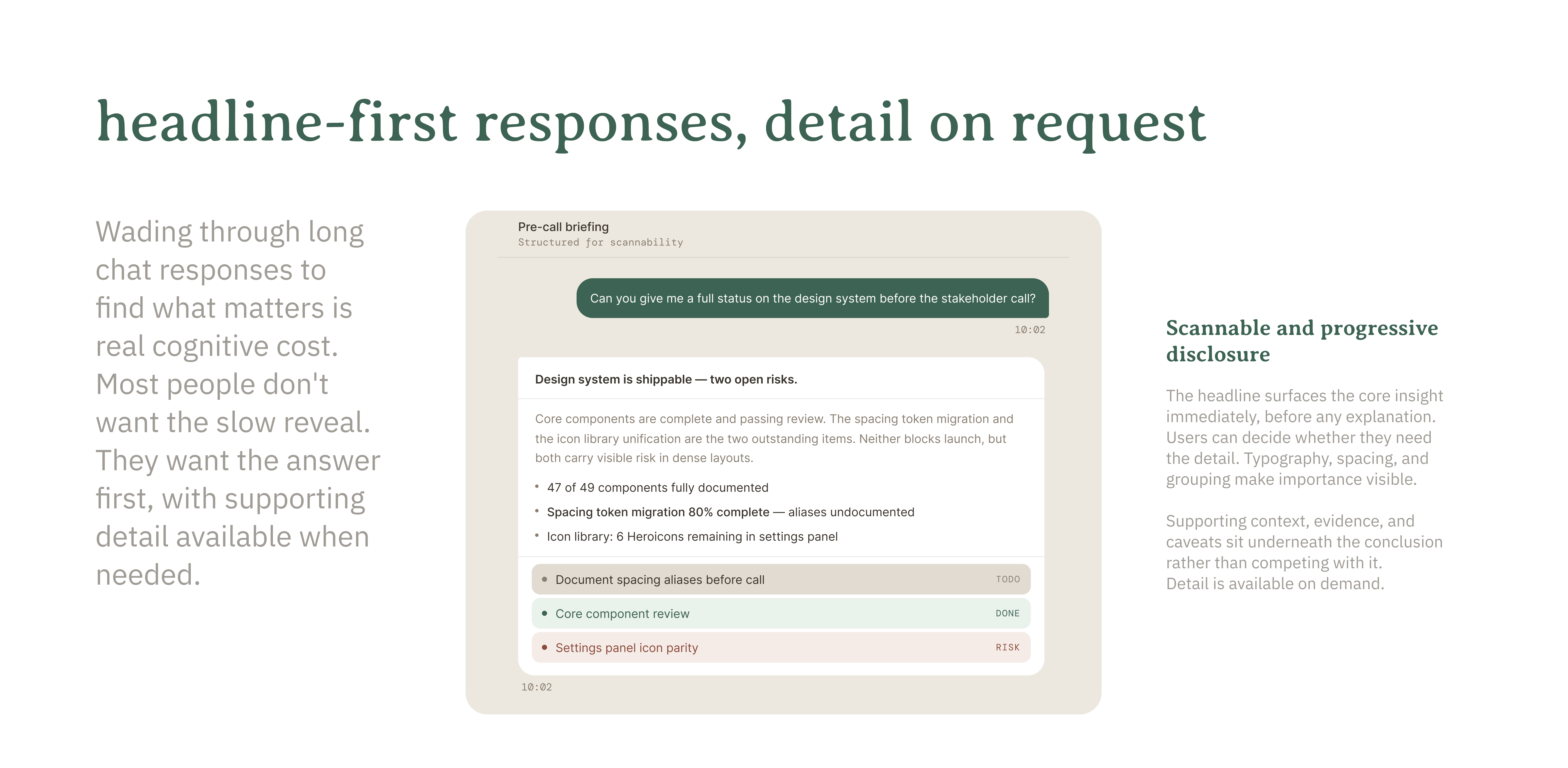
Design feature: headline-first responses, detail on request
Some chats bury the main point. Trying to wade through long text to find what matters is real cognitive cost especially if you're time-limited, and almost nobody actually wants the slow reveal. Leading with the key message, then offering detail underneath or on request, is filtering signal from noise by default. In McKinsey we call this “top down communication”.
Design feature: ranked, narrowed outputs
Infinite variations feel like power until they’re not. If a chat can generate fifty, the design question is how fast it gets to three good ones. Decisiveness isn’t helped by more material. It’s helped by a credible “here’s what I’d pick, and why”, a chat that filters before it hands something over.
Designing for self-regulation, managing motivation and frustration well enough to keep going
Design feature: undo and step-back at every stage
A lot of the anxiety in AI flows isn’t about not knowing what’s next. It’s about not being able to go back without losing everything. Pause, undo, step back, all without penalty, isn’t a safety net for edge cases. It’s what makes a tool feel safe enough to actually use, rather than something to brace against. This can also manifest as an audit trail.
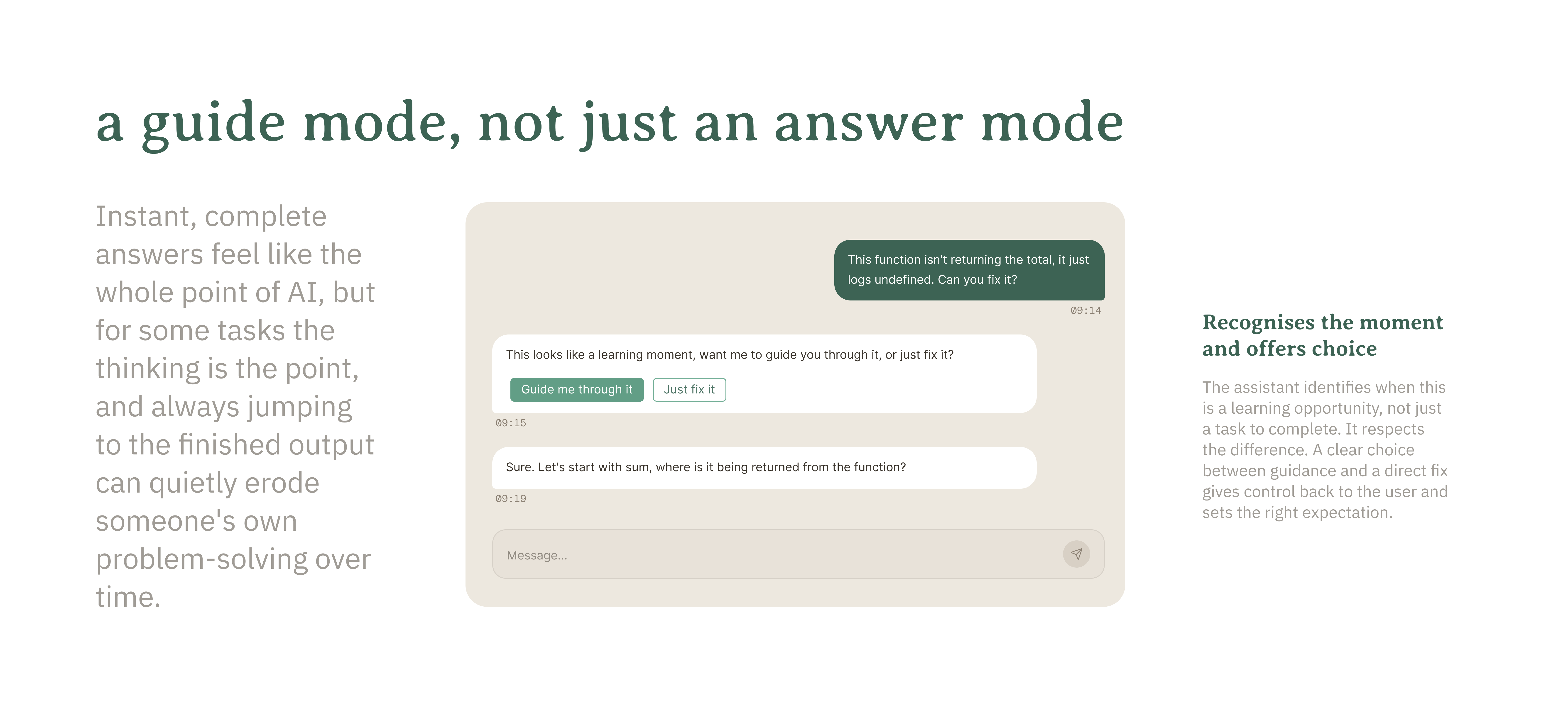
Design feature: a guide mode, not just an answer mode
Instant and complete answers feel like the whole point of AI, but for some tasks the thinking is the point and always jumping to the finished output can quietly erode someone’s own problem-solving over time. A chat that can tell the user “this looks like a learning moment, want me to guide rather than solve” lets the person choose and keeps the problem solving capability intact.
Designing for reconstitution, planning, generating options and adapting when the first idea doesn’t work
Design feature: a brainstorm mode, separate from the default
Sometimes the task isn’t “do this for me”, it’s “give me directions I haven’t thought of yet”. A brainstorm mode that is deliberately divergent and no pressure to pick an option, serves a different need than narrowing down. Divergent thinking needs room to roam before convergent thinking can do its job.
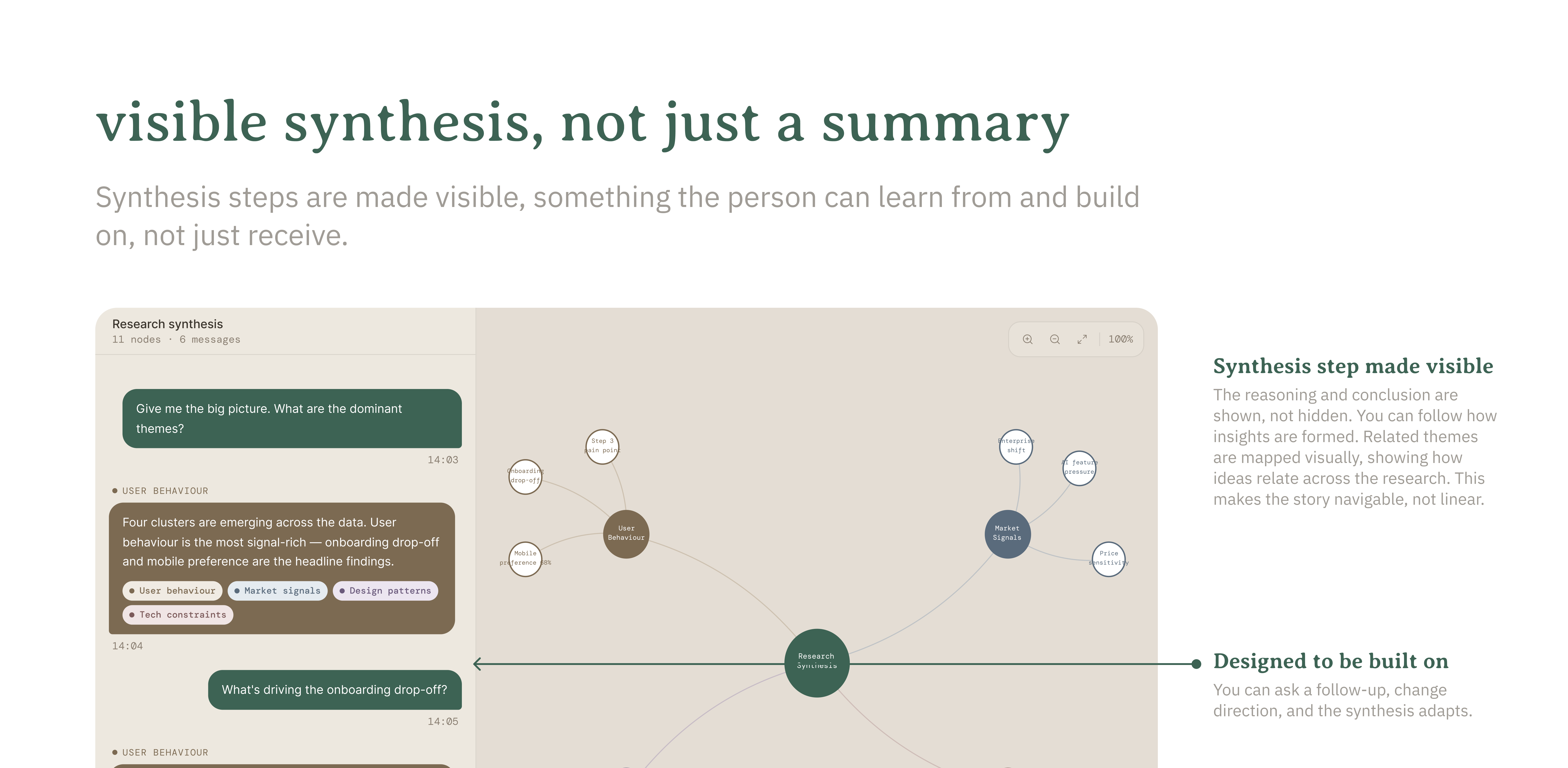
Design feature: visible synthesis, not just a summary
When AI pulls a scattered conversation into something coherent, the reasoning matters as much as the result. Not a black box “here’s your summary”, but something closer to “here’s the pattern I noticed, here’s what I left out”. It's valuable to make the planning and synthesis step visible, since it's something the person can learn from and build on, not just receive. As a creative having this visual representation is very valuable and can help promote further ideas.
Final takeaway: None of this is really about designing “for neurodivergent users.” It’s about who’s actually on the other side of the chat, and whether the interface was ever built with them in mind. Some people hit that gap once in a while, others live there, and closing it isn’t charity, it’s just better design!